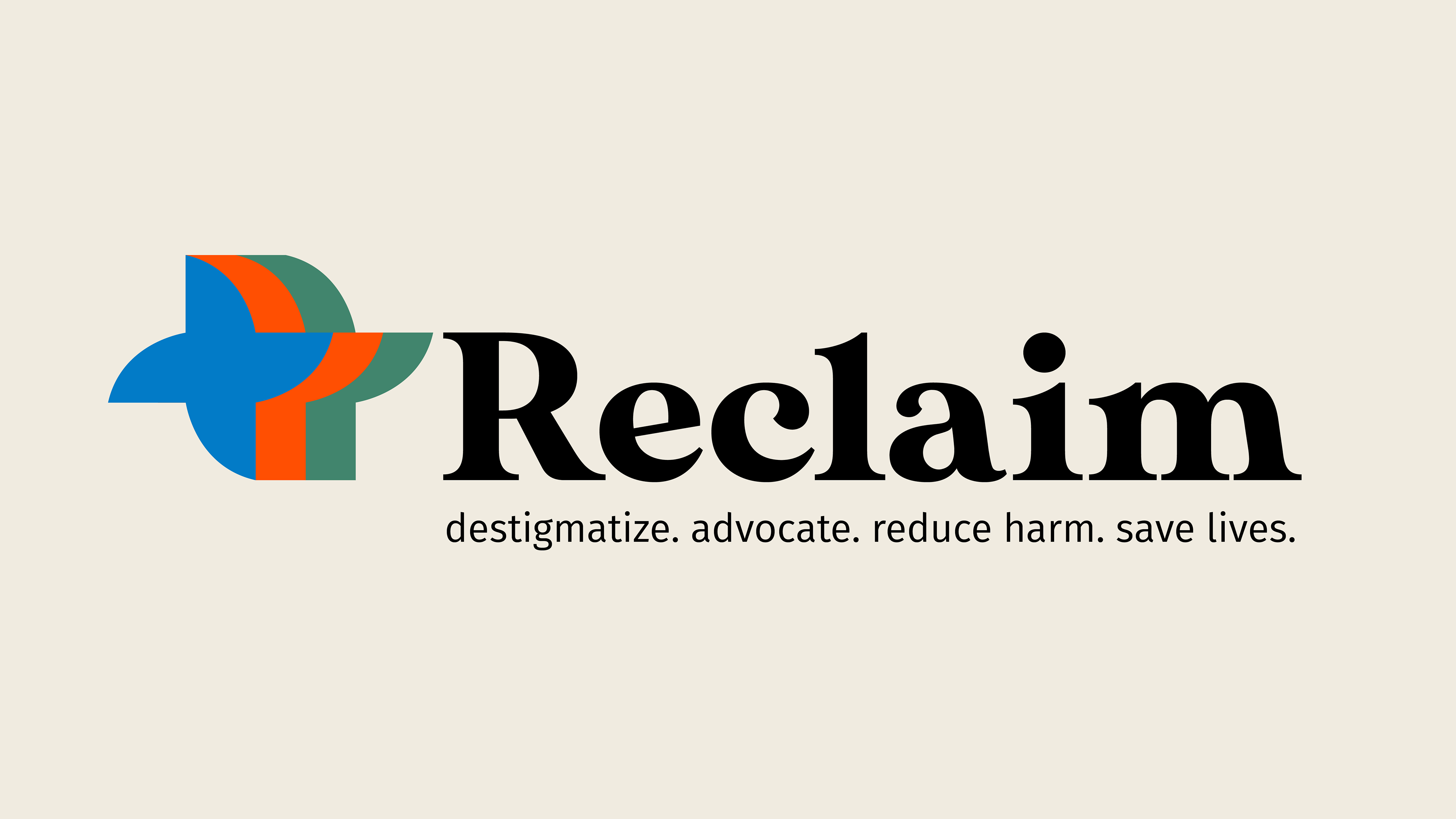
Reclaim advocates for the wider availability of naloxone in public spaces in an effort to destigmatize its use. Naloxone is a life-saving drug that counters the effects of an opioid overdose when administered promptly. Utilizing graphic design, I created a recognizable brand image that comes across as trustworthy, safe, and familiar. I incorporated the visual language of a medical cross and a hand being extended in a helpful manner into the logo, and a color scheme that unites function and psychology. The bright orange, associated with energy and urgency, is contrasted with the calming effects of blue and green, which are associated with tranquility, security, and sensitivity.
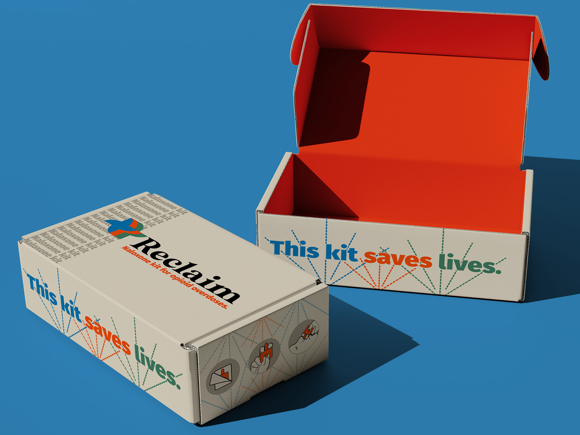
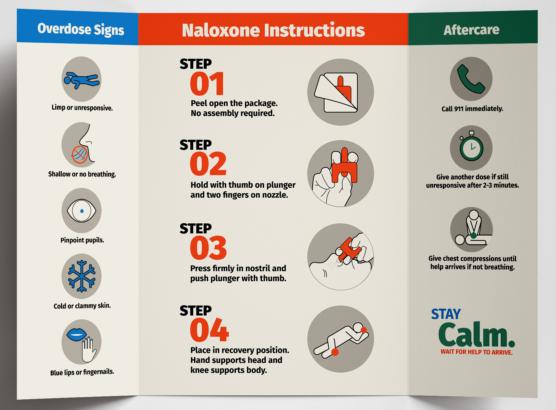
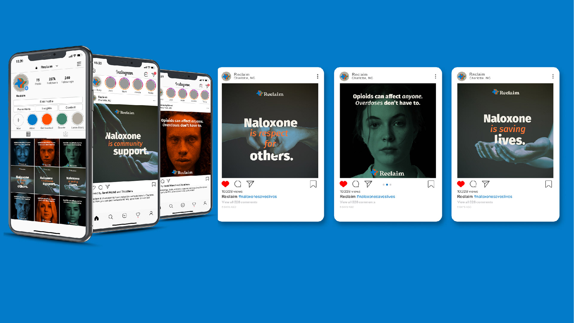
Additionally, Reclaim implements three primary products to better serve the community. A reimagining of the naloxone kit is more easily recognizable and approachable, so it is quickly found in an emergency situation. A simplification of naloxone instructional materials places emphasis on function, synthesizing information into fewer words and more easily accessible visuals in order to save time in dire moments. The social media campaign promotes the dissemination of naloxone and changes perceptions of opioid addiction and harm reduction methods. Through the imagery of everyday people, these ads emphasize respect for others’ choices and stress the importance of the right to naloxone for anyone who needs it.
This collection of products was showcased in the UNC Charlotte Senior Graphic Design BFA show, PRISM.
Logo
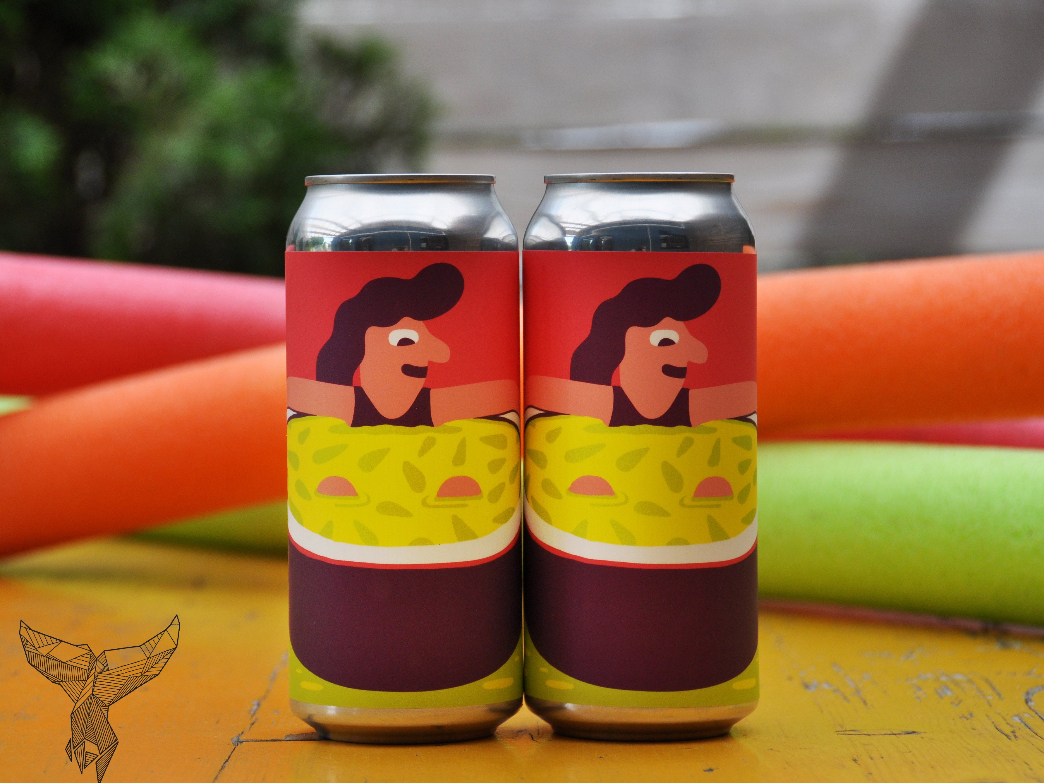
Naloxone Package Redesign
Naloxone Instructions Design
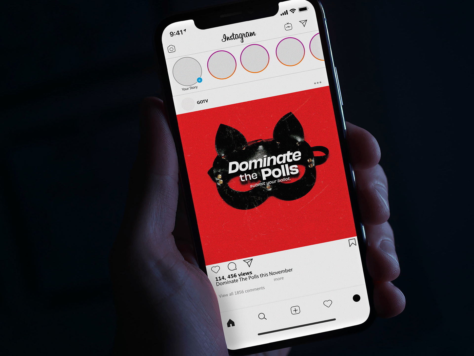
Reclaim Instagram Campaign
Gallery Reception Video